Research for Idea Factory Week
Hani Abusamra
Hani Abusamra is an illustrator based in North East London. The greatest feature of his works is clear frame of pattern. Also he uses vivid color and bold shapes in his works. His works are mostly digital based, they contains element of religion, science even his daily life.


Amelia 1 by Hani Abusamra Brigades by Hani Abusamra
In many of his works contain element of religion are still using pop colour he would usually use in his other works. I think his concept of merging religion elements together with modern art could help remove the barrier between religious and unreligious people in the future.
Austin Kleon
"Show Your Work!"
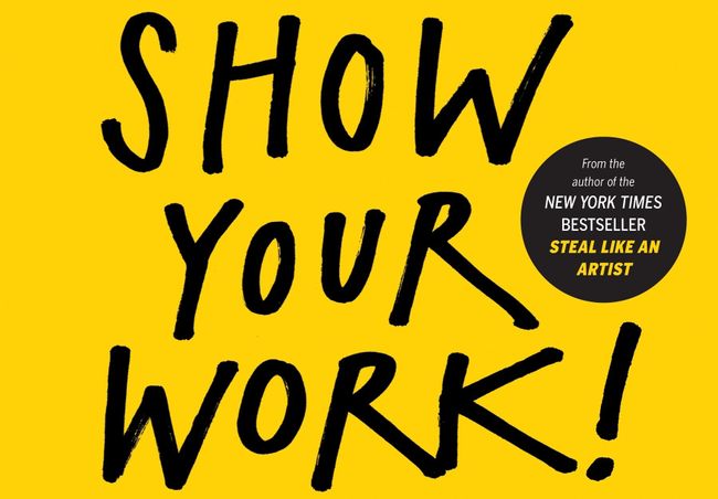
Austin Kleon, his book “Show You Work” taught illustrators how to show their work to the public. In Kleon’s word, become findable is not “self-promotion”, it’s “self-discovery”. I think this book is very useful for fresh illustrators in their future career.
My subject specialised in would probably be illustration. I’ve been long making choice between fine art and illustration. At the end, I still found out I am more into illustration. The biggest feature of illustration is using visual to convey deep meanings has in verbal. I like transferring texts into visual arts, I found that is attracting to me. Illustration’s design would mostly focus on public medias, for example, posters, book covers and etc. There’re also different areas in illustration. Like narrative illustration, architectural illustration, fashion illustration, medical illustration, and etc. Another reason of why I’m interested in illustration is that, I found out it is easier for me to produce works when there’s a specific, very detailed idea.
Research for Structure and Form Week
Naoto Fukasawa
Naoto Fukasawa is a Japanese industrial designer, graduated from Tama University in 1980 with degree in product design.
The work that most intrigued me is his selection that he designed for Plus Minus Zero. With. Simple lines that respond to the shape of object, some normal containers we use in our daily suddenly was raise into another level. The lines of the structures are fluid and simple. They don’t use bright colours to attract the customers. I especially like the way he only used black in his design, it made the customers pay more attention on the structure.
I found a journal text on “the189.com” written by Mark Robinson. He summarised what Fukasawa said about the ideal of the product, what he said was, “that the company believes that designing things that coexist together is natural, that it’s not just about matching colours or shapes”. So the company itself wanted to have product that makes harmony with the objects.
Paul Jackson
“Folding Techniques for Designers”
This book is about teaching people how to make various kind of origami. Origami have been a big interest of Paul Jackson, the author, as a teenager. After he finished postgraduate from Fine Art in London, he decided to set up an origami course a a job. Then students from fashion design, textile design, graphic design and jewellery design came. At first, Paul Jackson had no idea how to teach design students about origami. Then he came out with the idea to fold daily stuffs into origami.
Research for Surface and Meaning Week
Ellen Gallagher
Ellen Gallagher was an American artist born in Providence, Rhode Island. Ellen Gallagher’s works to me is somehow creepy and impressive. I especially like her portfolio “DeLuxe”. It contains sixty individually printed framed pictures. The base material used in these pieces are ads from magazines that aimed at African Americans between 1930s to the 1970s. She cut out parts of the advertisements and replaced them with wigs, underwears, beauty products and etc. Most pictures were black and white, but not those parts are placed by pink, red and yellow. It’s ironic how this project subverted the original intention with the title “deluxe”.
I’m particular interested in materials used in this portfolio and the process of making them. And I found a journal on “tate.org.uk", it gave me a lot of information about the portfolio “Deluxe”.
Ellen Gallagher really helped me get in known what we are suppose to succeed in Fine Art Painting workshop. So it's not simply about erasing something for no reason, there should always have a reason why you erased that part. Like I like replacing parts of pictures with other patterns, my purpose is to create new fashion that didn't exist on the models.
16/10/2019 Oleg Smirnov
I really like his works because of his textures. Even though the works has the texture look like chalk or oil pastels, they were all made in photoshop. Oleg's works helped me figure out the atmosphere I should be creating when I'm drawing a depressive scene.
Because my idea is sense of feeling lost, I want textures that make the pictures look depressive, so I thought I'm going to work in digital form as well cuz the textures are easy to create on computer.
16/10/2019 David Aguado
I really like how he uses light yellow that super stand out to emphasise the important element in the comic. You can read the comic by following the yellow object. And the way that different characters don't have some portion of black color on them identify their role and characteristic in the comic.
David Aguado's comic are usually very short but it delivers stories that are very powerful, he's good at shrink a long story into simple three pages. The frames are silent so you need to read the details in pictures so you can understand the story, sometimes take me many times to read his comics so that I can understand. I think I can use the method David used to make the picture look impressive and make the protagonist to stand out.
16/10/2019 XL Recordings
Conan O'Brien
I also considered doing animation during the research, so I had look at Conan O'Brien's pieces. Because the idea of this animation is about the artist's friendship with one of this friend, so I guess they probably did music together and what's showing in the animation are the things they did. I'm really into the white spots in his work that makes the work look like an old movie. The red shape working as the background is actually always existing in the screen if I slow down the animation, it's just changing forms. I think I'm gonna slow down the animation to see how the white lines are moving so I can learn to create a fluid animation as well.
Research on narrative comic
The object looks very obvious as only the two characters has color, and it gives high visual impact because of the bright colors.
The comic has clear connection between frame to frame. The focus are different in each scenes, it shows the important object or the story telling in this block.
The using of light is very beautiful because the light are warm but the whole tone of the comic is covered with cold blue and purple. The viewing angles are very interesting in this comic. This comic is different from the previous one, it doesn't have much fluidly connected frames, but the readers can still be clear about the whole story.
Research for Body and Function Week
In this week’s workshops, the specialism that most interests me is fashion photograph. At the first place, I have had interest in photograph for long time. I like the way you can apply unique style to photos by changing the angles, shadows or lights in photography. Also I think photography is the easiest way to show your ideas to others. Usually before I paint, I would take photos to simulate the image. To consider my future career as a photographer, I can shot photos for fashion brands, magazines or journal pages. There’re many famous photographers like Petra Collins, who shots photos for Gucci, they take pictures for fashion brands, also they would have casual photos they produce in daily life.
Viviane Sassen
is a Dutch photographer who works in fashion and fine arts.
Viviane Sassen, Ra, series Mud and Lotus, 2017.
In this piece of work, the colour contrast especially interests me. The arbitrariness of smearing the white paint on the black model’s hand, it looks like the model is holding the ocean in his hand. The red at the back is just the contrast colour of blue. The whole colour setting in this photo is very vivid, which attracts me a lot. It’s the right choice that Sassen choose a black model, the dark skin colour make the photo more powerful.
There’s a journal text on “itsnicethat.com” written by Billie Muraben. The title of the journal is “An eye for the uncanny: Viviane Sassen on her concurrent exhibition with Lee Miller”. She is evaluating several Sassen’s photos and talking about her unexpected creativity. “Sassen’s work makes you doubt yourself, and your assumptions about what you think you know and understand.” I like this sentence cuz it’s just what I saw in Sassen’s works, they make me think an I understanding the meaning of the pictures.
Janice West
"Made to Wear: Creativity in Contemporary Jewellery"
In this book, included many innovative jewellery designs, they are meant to overturn the contemporary traditional jewellery. Because is a book, the jewelleries are displayed by digital photographs. I like when the photographer is not including the model’s face in the photos, so the jewellery can stand out. The jewelleries in this books are all innovative, not traditional but also can fit to body, like the title say “made to wear”.
The Surrounding Primary Resource
I took the pictures around my accommodation. I mostly focused on looking for crossing lines, cuz they usually form interesting and weird shapes.
Research for Language and Interaction Week
Peter Saville
Peter Saville is an English art designer and graphic designer. His works are full of diversity but his unique personal style can still show out obviously. He designed the last album cover of Joy Division, “Closer”, shortly released after the leader of Joy Division, Ian Curtis’s suicide. In this album cover, his design of Christ’s body entombed was controversial but the design foreshowed the death of Ian Curtis. Looking at this album cover, I’m strongly feeling the sorrow of mourning someone’s death coming out of it. First I mistakenly thought the person at the very left has wings on its back. Afterward I found out it was not, but it’s still very attractive how the light is making it look like wings, it created a holly and peaceful atmosphere for the picture. As a graphic designer, Saville’s works always has a sense of calmness.
I found a journal on “theguardian.com" analysing Saville’s pieces written by Gareth Grundy. He quoted Saville’s work in the paragraph about “Closer”. When Saville was told Ian Curtis died, he said to the Factory co-founder, Tony Wilson, “Tony, we have a tomb on the cover.”
18/10/2019
I was very intrigued by the organic shapes the surface of water makes. I think it would be very useful in my drawings, I can individually take out the organic shapes to show the texture of water.
18/10/2019 Fluid Acrylic Painting Research
I have a lot of water to draw in my pictures and I realised that fluid art look like running water, so I researched different ways to do fluid art, as well the materials using. I could make some fluid art pieces and pick parts of them and use them as the texture of water in my works.
Rinske Douna - Black with Metallic
Full Link: https://www.youtube.com/watch?v=VGoK2fJkVHE&list=PLBFr-muI75BT1dJ516Bl7rmkguOncqgIi&index=49
Waterfall Acrylics
#151. Elegent!! Fluid acrylic Painting and Finding hidden color
Full Link: https://www.youtube.com/watch?v=CJjBc4oOK6A
Sheleeart
Sheleeart is an artist specially working in fluid art. Her work's biggest feature is that they alway have big and dense cells, I found them very similar to bubble's in water. Because I don't know how she does it for now, I think I'm gonna try to draw them and utilise the shapes when I'm drawing bubbles in my pictures.